ENTERPRISE design
Care Navigation
A tool that helps doctors recommend patients to care programs, designed around the moment a decision can actually be made.
Role
Lead Designer
Team
2 PMs, 3 Engineers
Timeline
Apr - Nov, 2025
Key outcomes
11x recommendation volume growth within first month
Scaled across multiple EMR platforms
Established design patterns for future applications

context
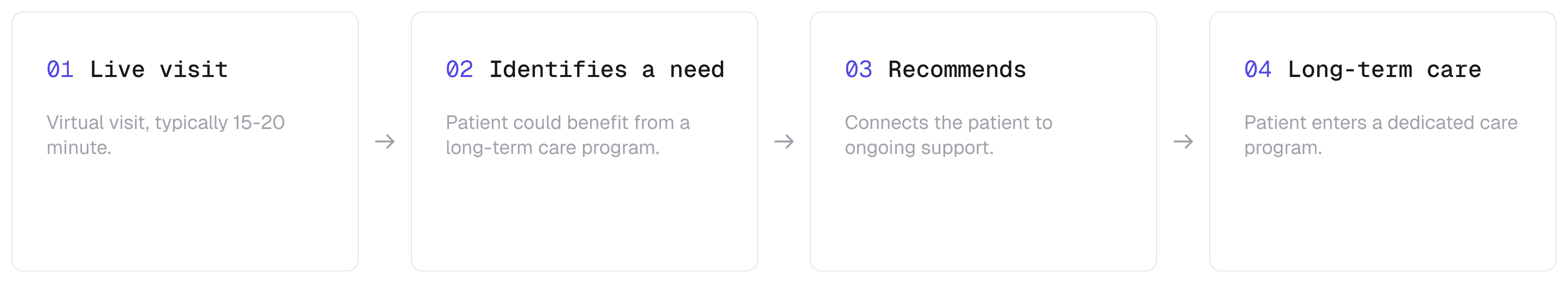
A 15-min visit, a long-term outcome.
Here's the basic flow. A doctor starts a virtual visit. The system identifies that the patient is eligible for a care program. The doctor reviews the recommendation and can act on it through the side panel — without leaving their current tool. And the patient gets connected to the right program.
surface
One tool, embedded across 4 EMRs.
Doctors work across multiple EMR systems, each operating in isolation. The company already had a side panel that sits alongside these EMRs. One tool, embedded across all platforms, so doctors never need to leave their current system.
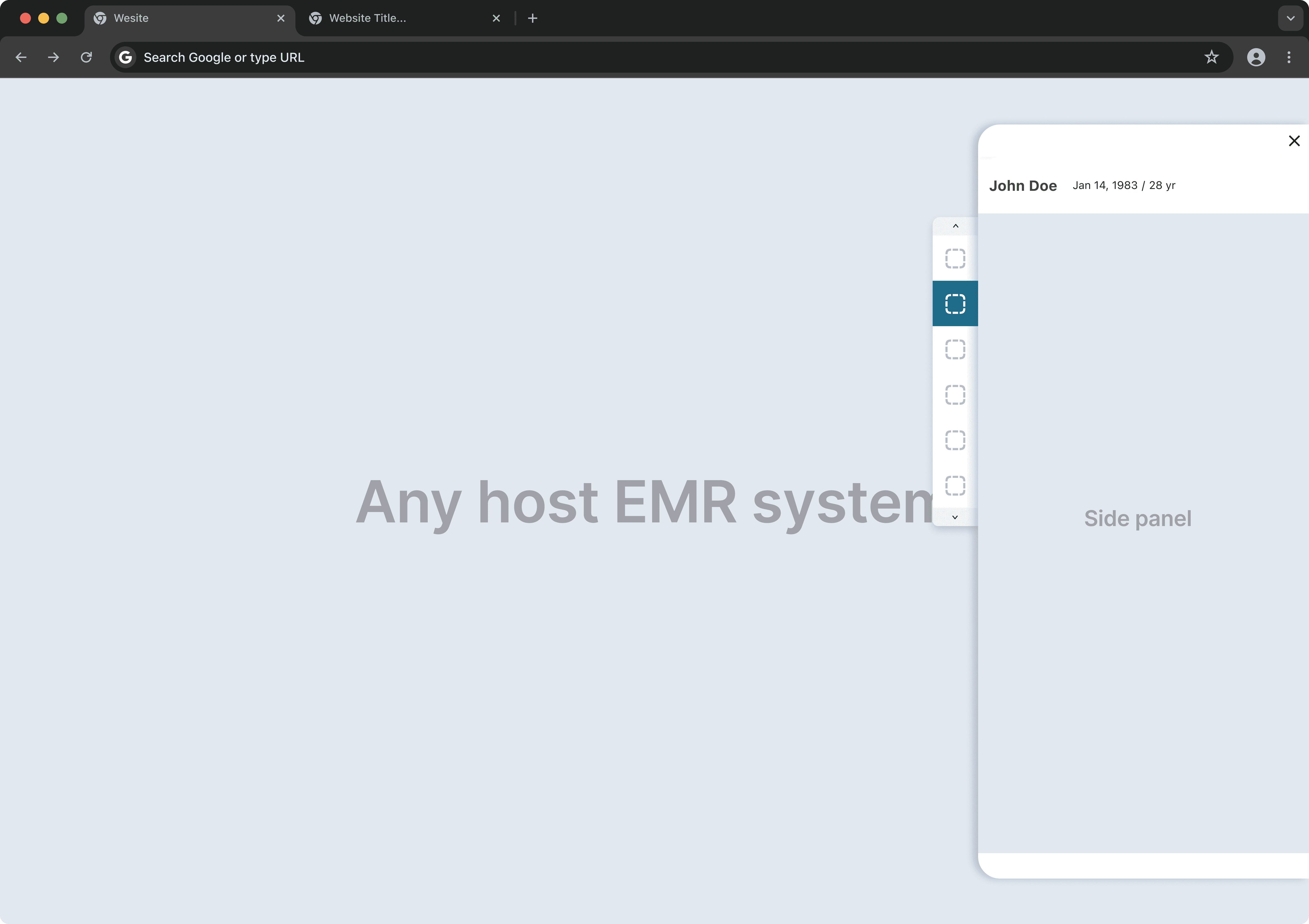
I was brought in here to design the recommendation tool that sits on top of the side panel.
Challenge #1
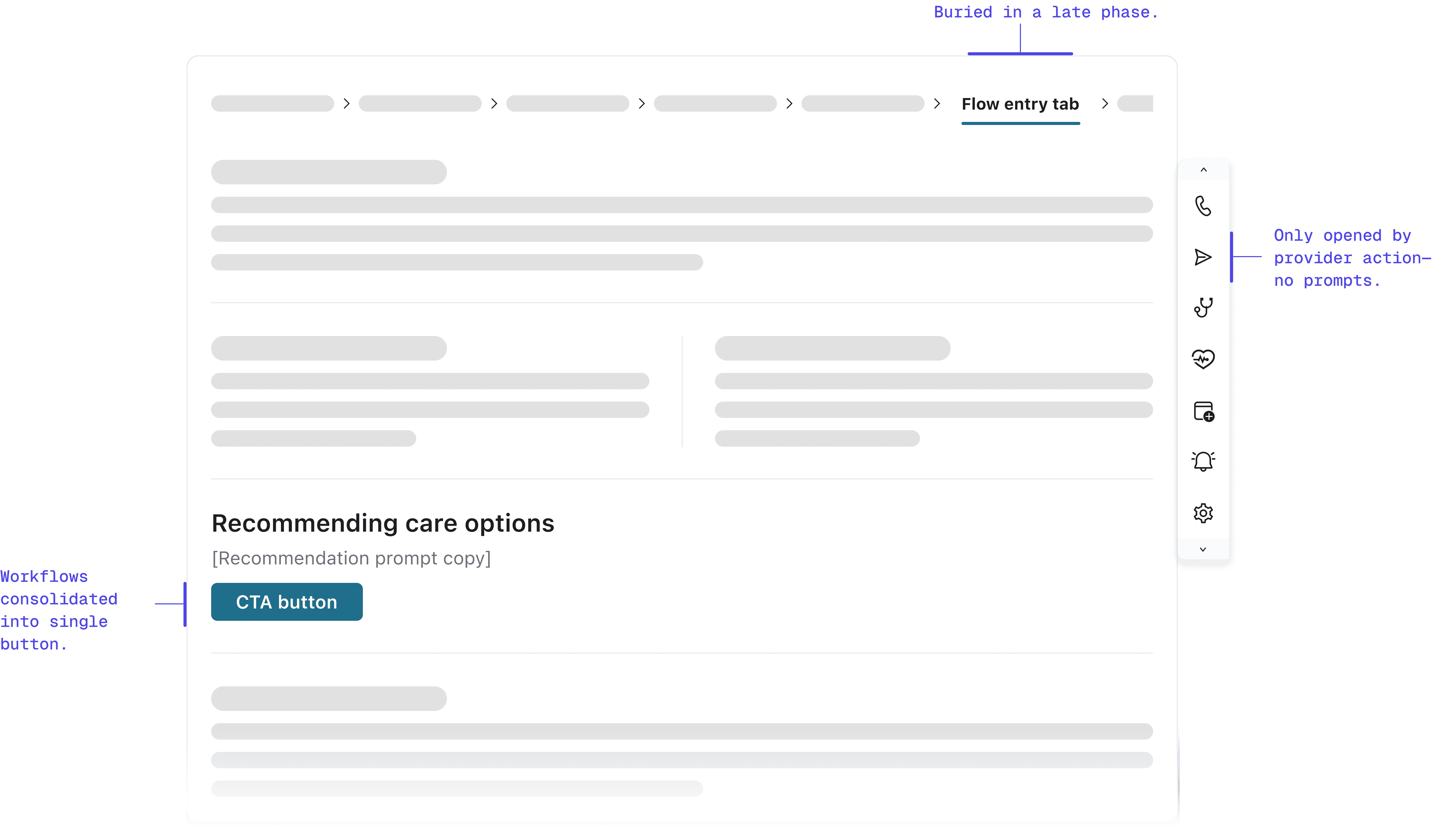
We replaced an inline workflow with a button. Volume collapsed.
When launching the sidecar, we replaced the legacy embedded workflow with a prominent button in the exact same location.
We assumed habit would drive clicks. We were wrong. By moving the workflow out of the main view and behind a click, referrals transformed from a natural workflow step into an "optional detour." Engagement plummeted immediately.
research
The drop was too large for UI tweaks to explain.
Talking to providers revealed the root issue: banner blindness. Even though the entry point was visible, it looked like static information rather than an actionable tool. In a high-pressure clinical environment, passive tools fade into the background. I needed to shift from passive availability to active assistance—without adding cognitive friction.
explorations
Two paths I considered, neither felt right
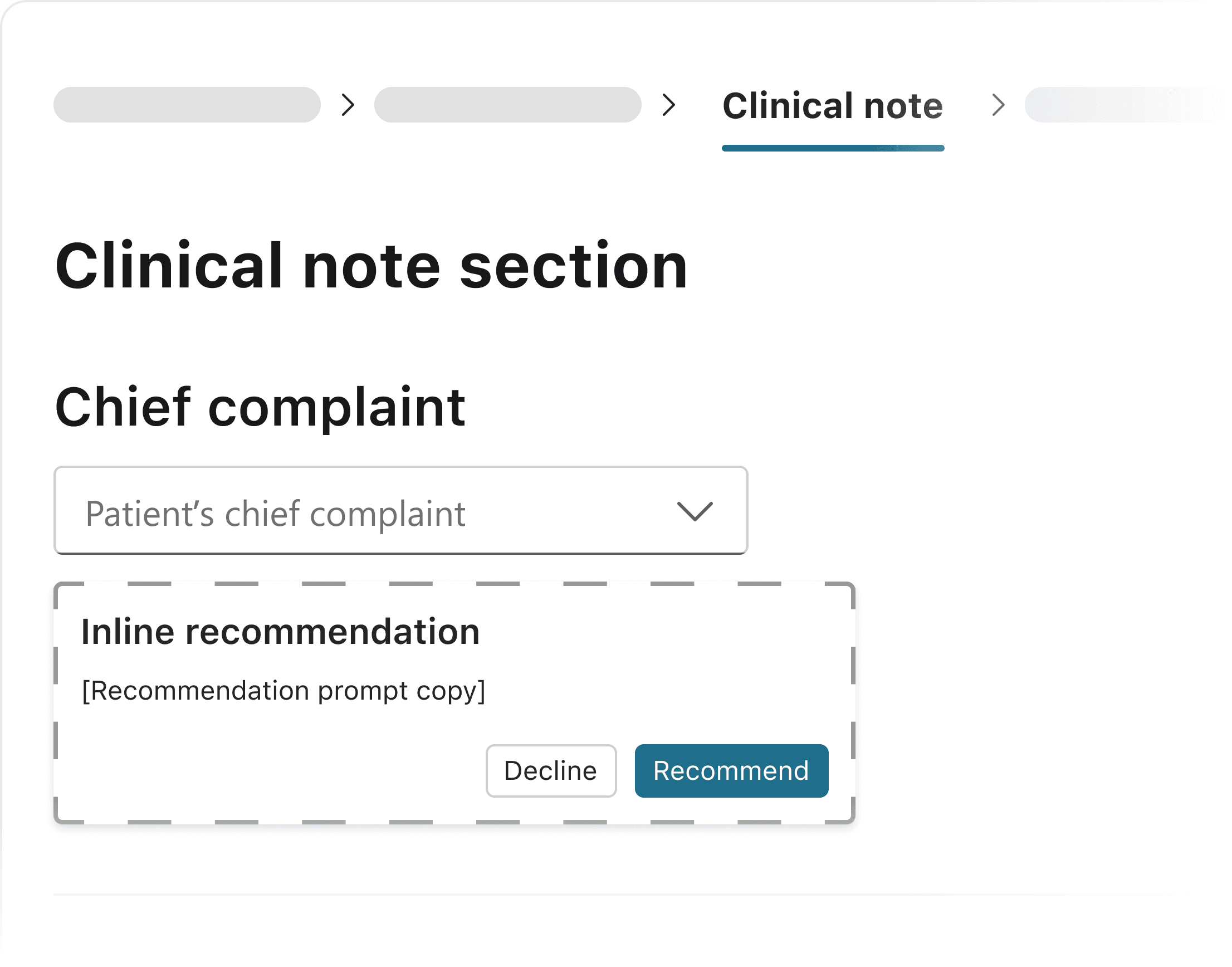
Explored option #1: Embedded card
I considered an option in the chief complaint section for earlier, more contextual placement. It serves as an inline card instead of pop-up.
Pros:
Highly contextual
Early intervention
Cons:
More dev efforts
TOO early in the flow (providers haven’t finished diagnose)Early intervention
Explored option #2: Opt-out model
One option considered was auto-presenting recommendations, but this conflicted with doctor autonomy.
Pros:
High conversion potential
Reduce friction for adoption
Cons:
Violate user agency
Create opt-out fatigue
Extra clicks
solution
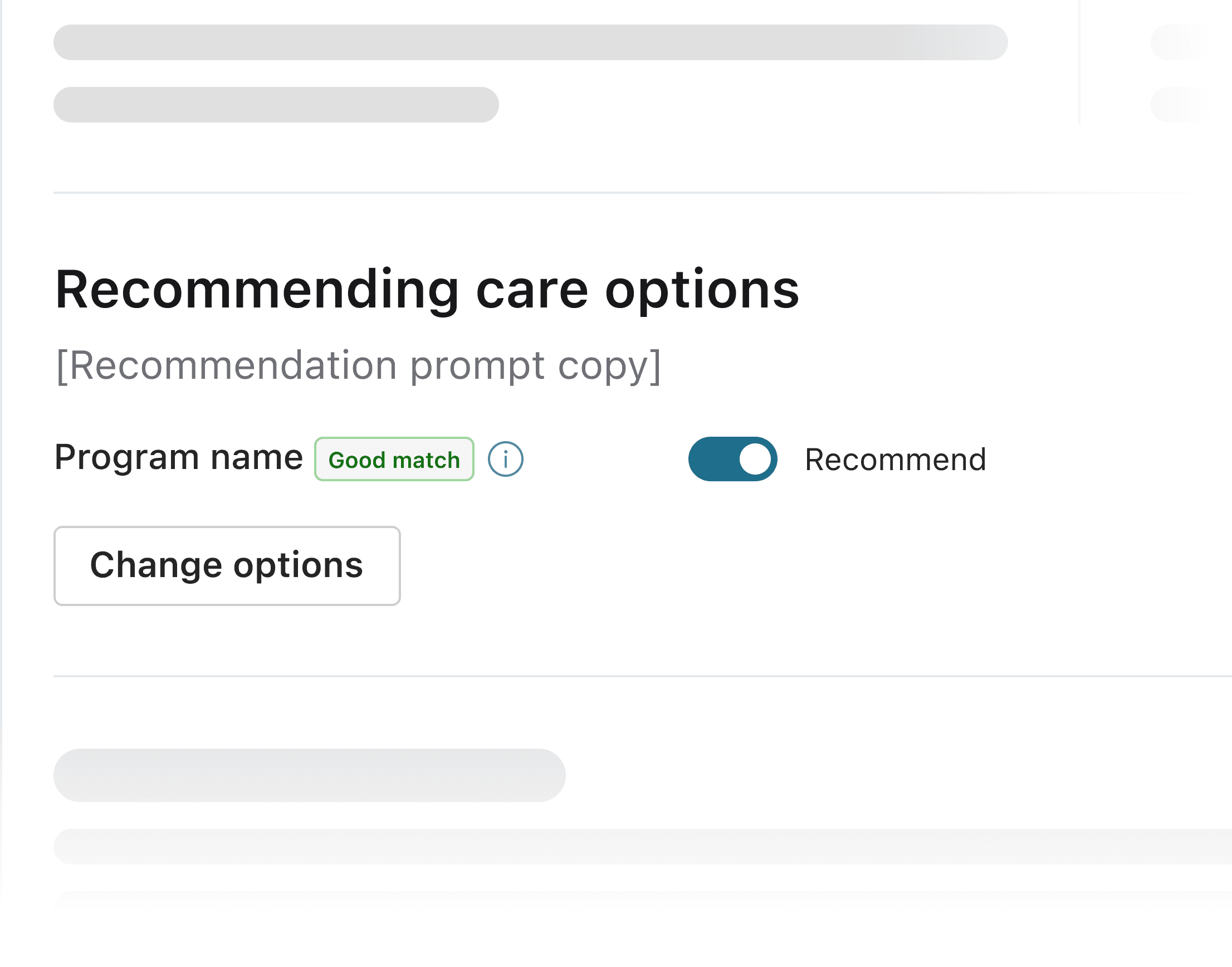
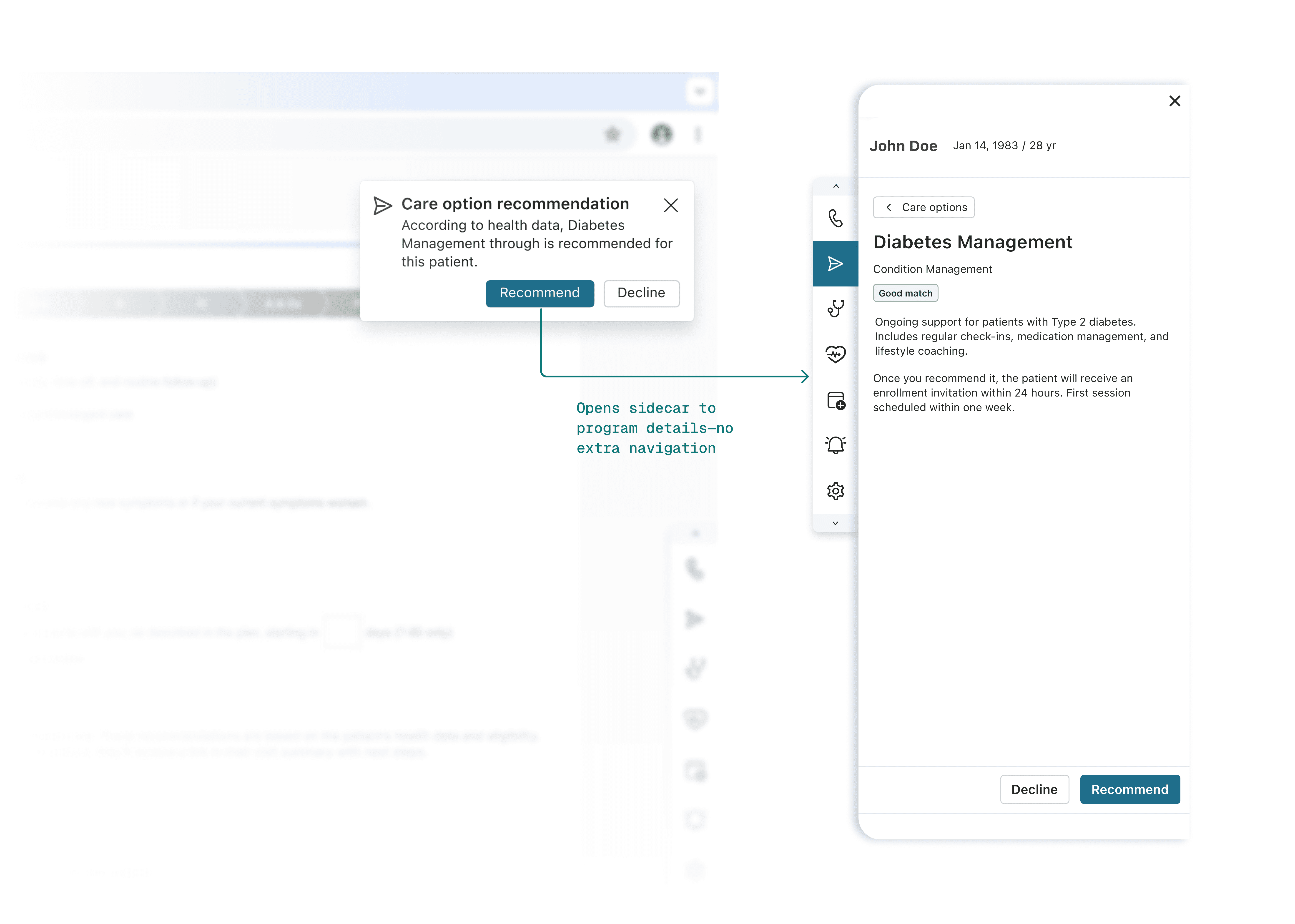
A prompt at the moment the decision happens.
I chose a contextual notification in the Follow Up tab—precisely when providers are formulating care plans. Instead of disrupting the clinical workflow upstream, this nudge appears downstream, serving as a just-in-time reminder exactly when the decision is being made.
Why this timing worked: leveraging existing behavior
This timing wasn't arbitrary—it leveraged providers' existing muscle memory. In the legacy workflow, providers made referrals in this exact tab.
By keeping the notification in the same location, we reduced the cognitive load of adopting a new pattern. `We'd already changed the interaction model (embedded → sidecar). Changing the timing too would have compounded the disruption.` This "minimal effective change" approach proved critical: providers could maintain their existing workflow rhythm while adapting to the new interface.
outcome
11× recommendation volume, sustained.
Notification-driven activation proved effective: recommendation showed significant sustained growth over the legacy workflow.

Challenge #2
Balancing partner requirements with internal program priorities
As Care Navigation expanded to include external referral partners, we faced a strategic deadlock: balancing external partner requirements with internal program priorities. We needed a way to fulfill contracts without diluting core business value.
Exploring de-emphasis
I initially framed this as a suppression challenge—finding ways to show external options without giving them visual weight. Each approach added complexity without solving the tension.
Through rounds of provider and stakeholder feedback, patterns emerged. They wanted simplicity and upfront visibility—they wanted to see available programs without extra navigation. Stakeholders emphasized consistency—visual treatments that felt disconnected wouldn't work.
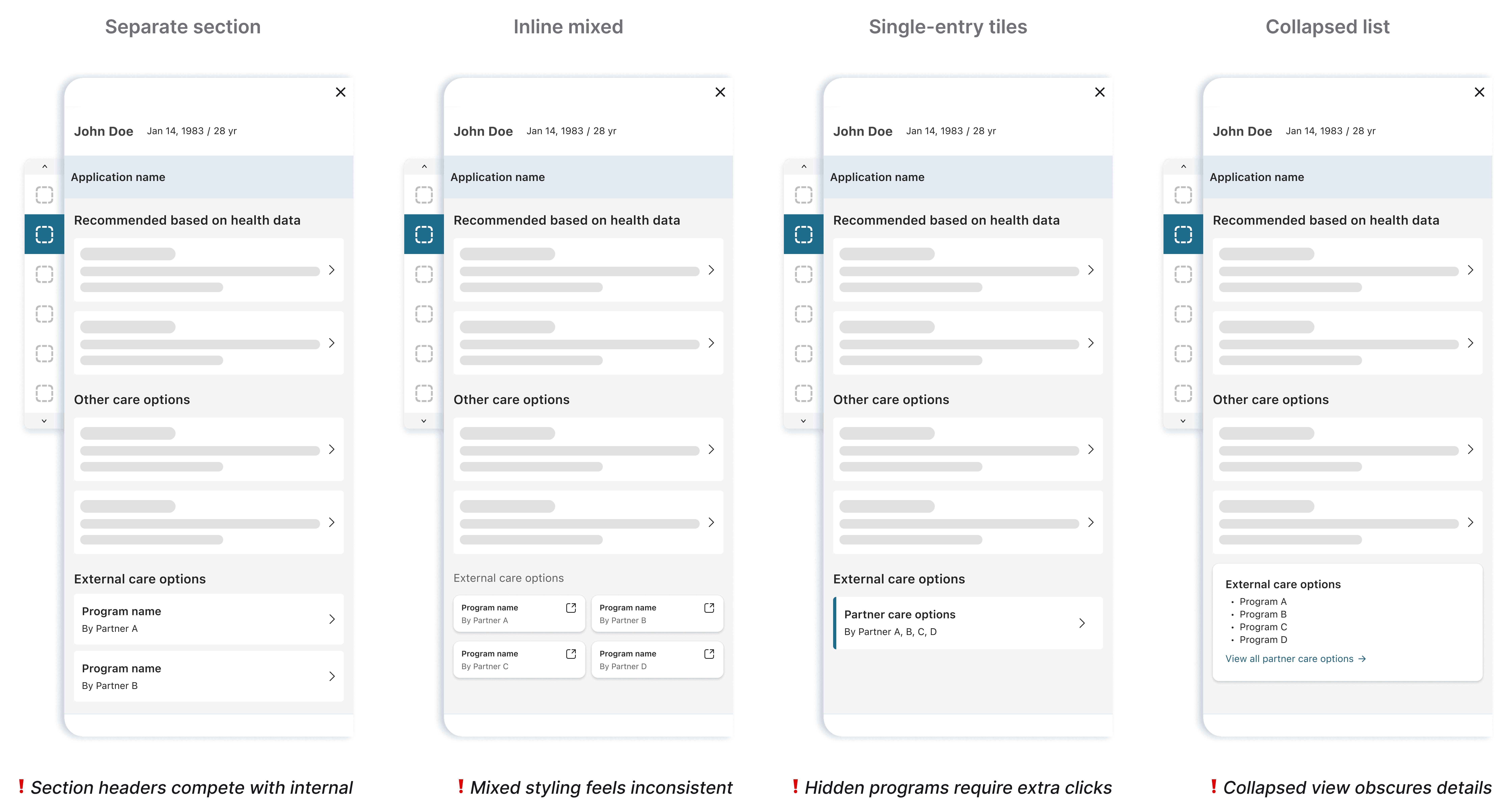
Final decision
Reframing the solution
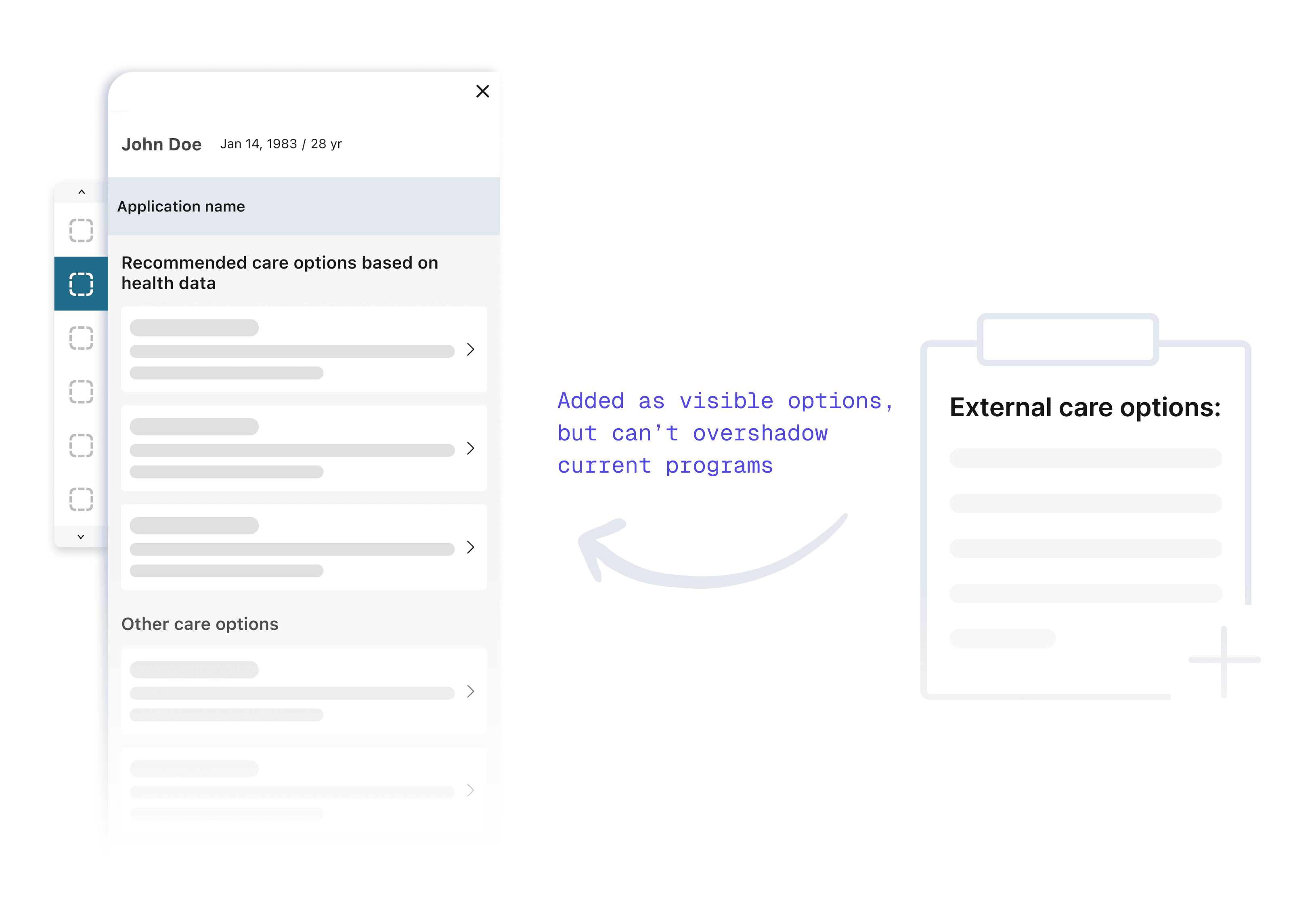
I realized I was designing for the org chart, not the user. Providers don't categorize care by "Vendor Source" but by "Clinical Need."
Instead of segregating options, I created a single list organized by clinical relevance, which naturally surfaced the most appropriate options first.
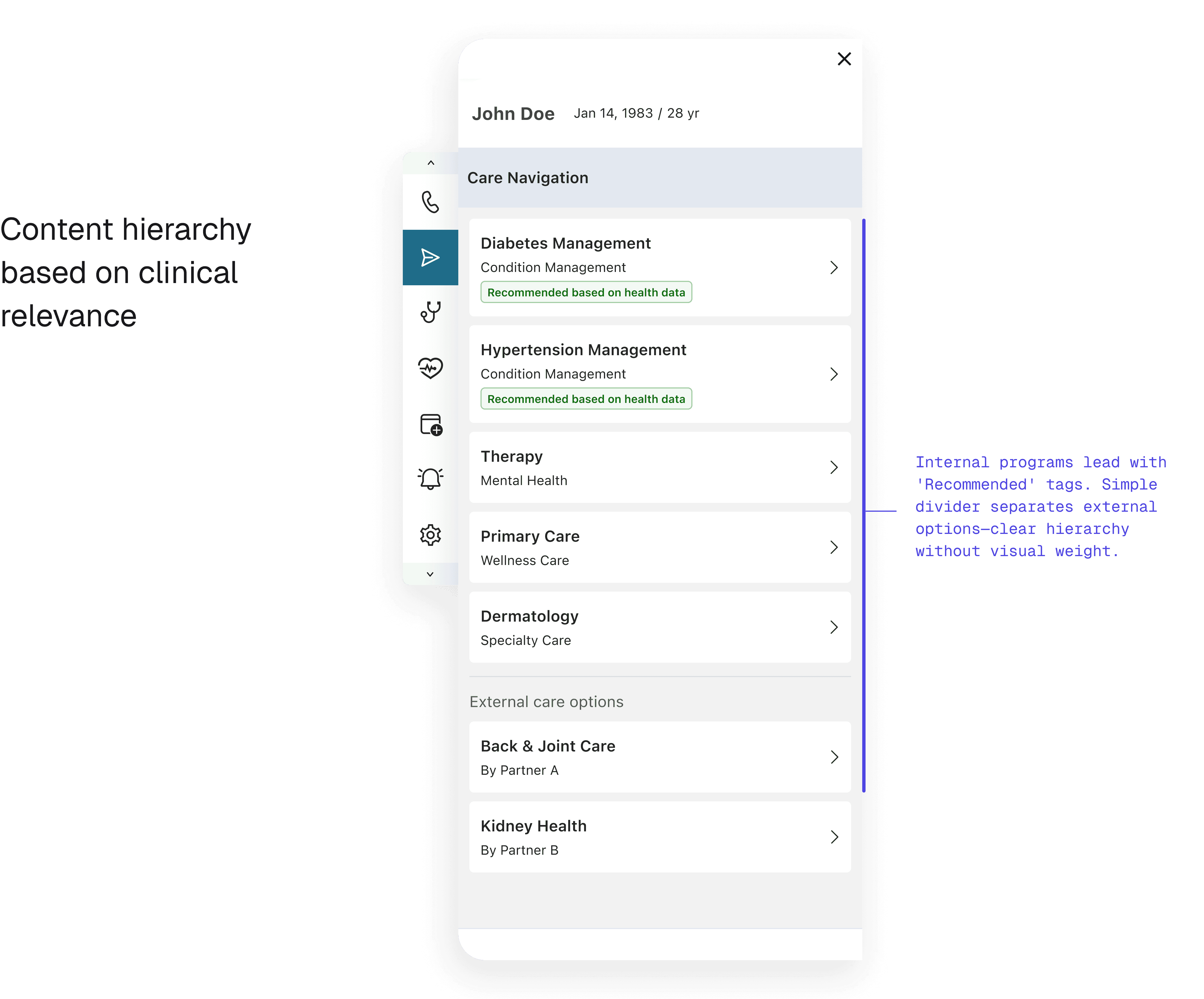
How sorting logic satisfied both sides
The solution relied on intelligent sorting: - Programs ranked by clinical relevance and insurance coverage first - Internal programs benefited from tighter system integration, naturally appearing higher in results - Partners remained visible and searchable for all applicable cases
This approach satisfied both contract requirements (visibility) and business priorities (internal program preference) without requiring artificial suppression.
The Outcome: Compliance without Compromise
The unified list resolved the stakeholder conflict immediately:
Partner Compliance: Achieved 100% visibility requirements.
Internal Priority: Internal programs retained #1 slot positioning.
UX Win: Reduced searching time, allowing faster care coordination.
Reflections
What this project taught me about ecosystem design
Behavior change compounds, users need to be informed
When changing the container (embedded → sidecar), I’ve already spent the disruption budget. Changing the timing too would have asked users to rebuild two habits at once. I learned that behavioral redesigns need to preserve at least one familiar anchor.
User-centered frameworks resolve stakeholder conflicts
The partner visibility problem seemed political until I reframed it around how providers actually think. They don’t categorize care by source — they categorize by clinical relevance. Once I organized the list by clinical need instead of business origin, the political tension dissolved because the hierarchy was driven by the user’s mental model, not by our org chart.